What the Journal Covers
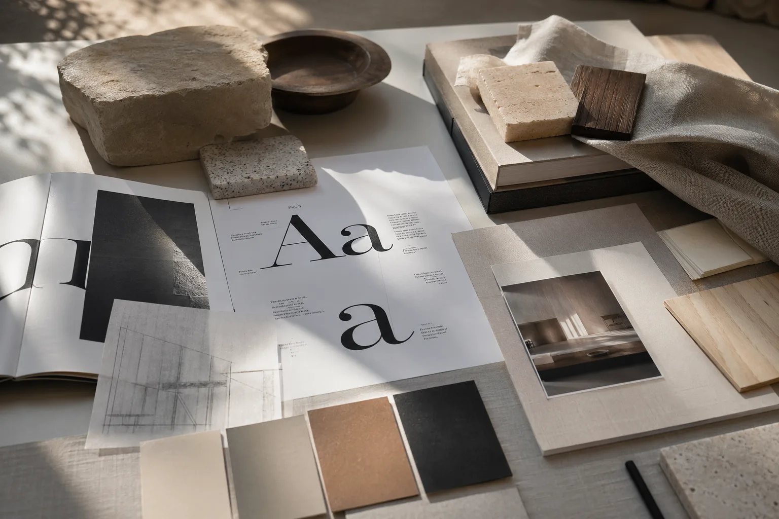
Compulsive Bodoni explores how typography, visual systems, surfaces, color, and spatial design influence perception and emotion. A serif title, a chalky wall, a deep hallway tone, and a carefully edited shelf all participate in the same visual conversation. The site exists to study that conversation without turning it into lifestyle fluff or service-business sales copy.
The articles move between disciplines on purpose. Typography and Emotion opens with the emotional work of letterforms, while essays on surface texture, light behavior, and material perception extend the same logic into rooms and objects. The through-line is always attention: what the eye notices first, what it trusts, and what it remembers.
Editorial Position
This is an independent editorial blog, not a commercial contractor site, not a product catalog, and not a generic inspiration board. The tone is intentionally educational, magazine-like, and observant. Readers should come away with sharper language for describing why certain spaces feel balanced, why some materials dominate quietly, and how color and hierarchy create emotional pace.
If you want a starting point, continue from here to visual hierarchy in interiors, color psychology in rooms, or the broader essay on continuity from print to interiors. For editorial notes and outreach, visit the contact page. For publication policies, see the privacy policy and terms and conditions.