A strong brand and a strong room share a surprising number of habits. Both rely on repetition without monotony, distinctiveness without chaos, and tone without overstatement. When interior designers borrow the discipline of editorial identity systems, spaces become easier to remember because every element feels like part of the same sentence.
Reading Material, Light, and Perception Together
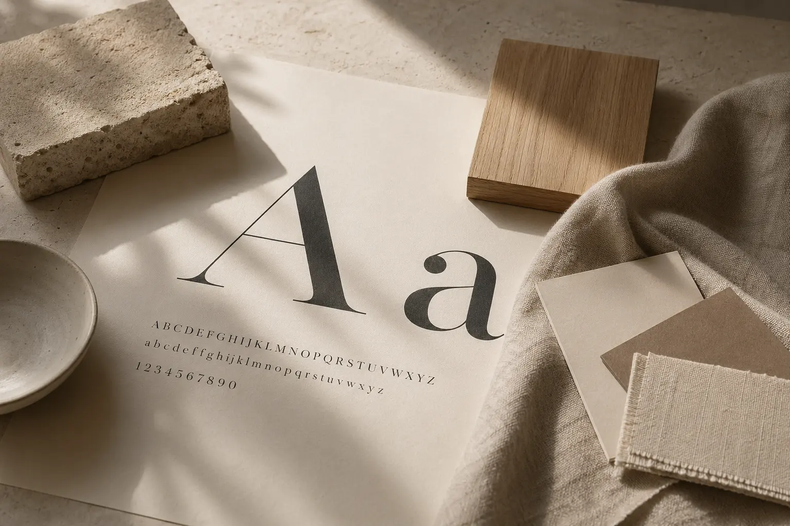
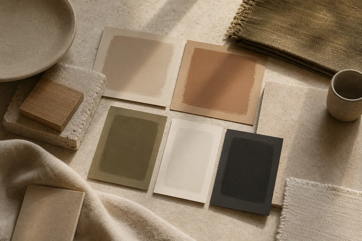
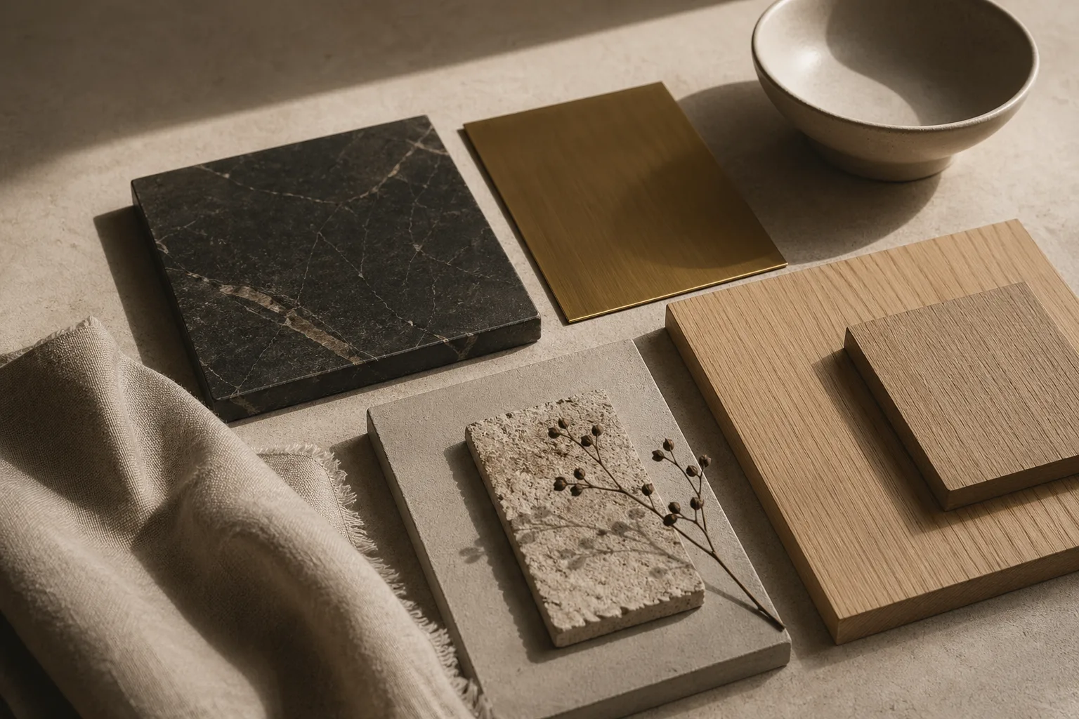
The first lesson is consistency of voice. In branding, a typeface, palette, and spacing system help audiences recognize a publication before reading a single word. In interiors, the equivalent may be the recurring radius of edges, the repeated warmth of timber, or the disciplined use of metal accents. These cues do not need to be loud. Like the typographic atmosphere explored in our typography essay, they simply need to be coherent.
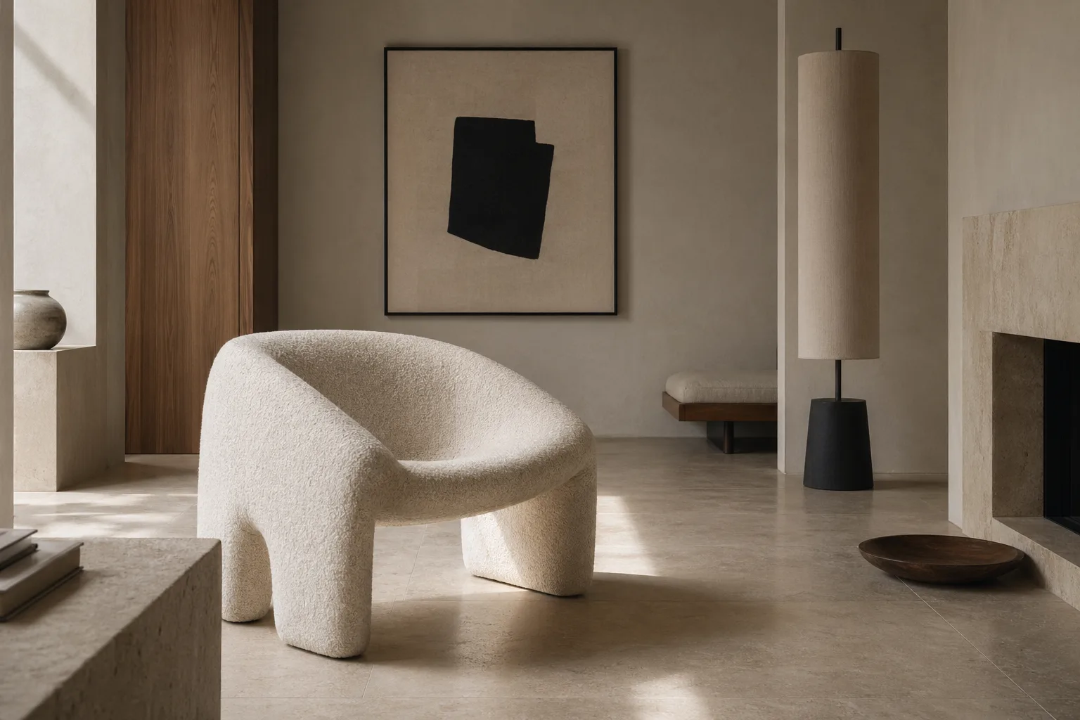
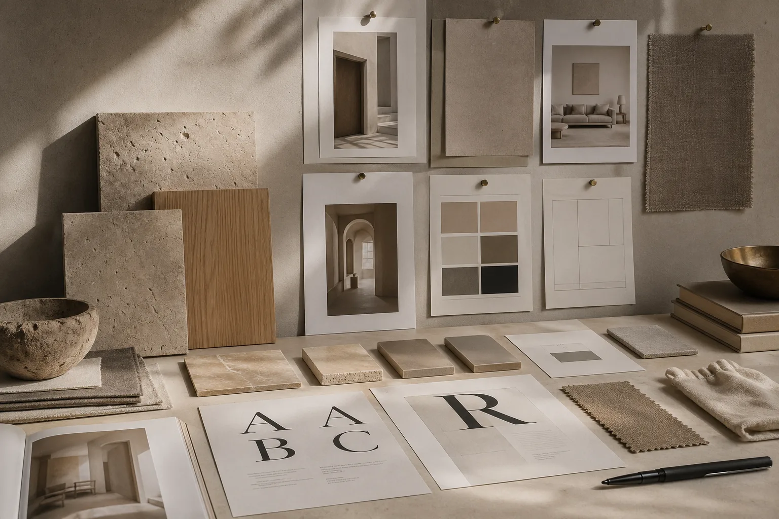
The second lesson is pacing. Great magazines know when to offer a full-bleed image and when to let white space do the work. Rooms behave the same way. A dramatic material moment is more convincing when the surrounding surfaces are restrained. The best examples of interior hierarchy and clean modern surfaces both rely on this editorial kind of restraint.
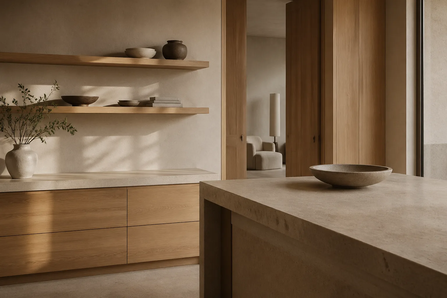
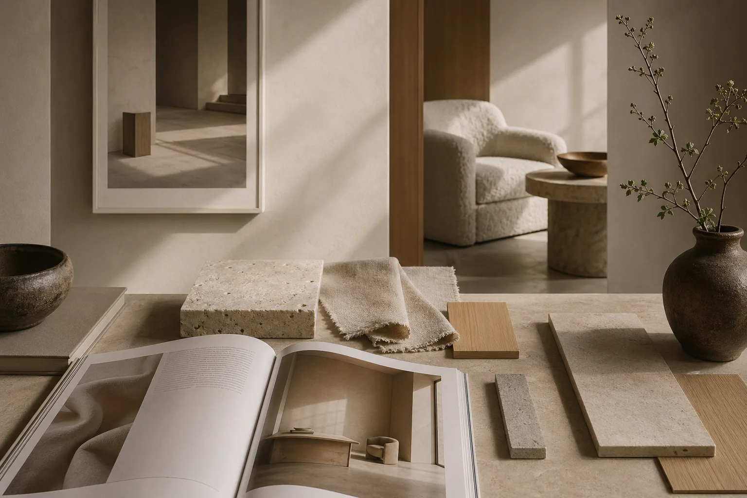
Brand systems also teach the value of controlled variation. Not every room, object, or corner should repeat the same note. Instead, there should be a family resemblance: similar proportions, compatible textures, and a shared emotional register. That is why materials, color, and light must be considered together rather than as isolated decisions.
When spaces learn from branding, they become less generic and more legible. They start to communicate identity through sequence and texture rather than through slogans, making them feel authored without ever feeling overdesigned.
Where to Go Next
For a broader editorial map of the site, visit the about page, browse the latest writing on the homepage, or continue with linked essays on typography, color psychology, and cross-disciplinary design continuity.