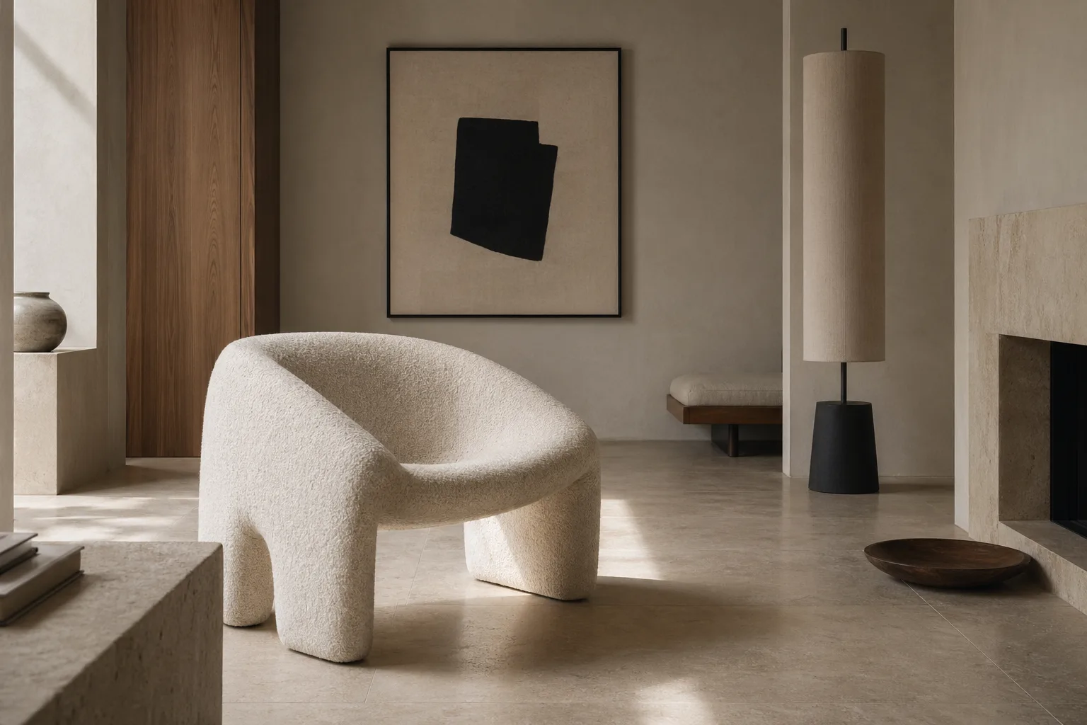
Visual weight is the reason a slim black lamp can command more attention than a larger beige sofa. It has less to do with actual mass than with contrast, density, color depth, texture, and placement. Designers who understand visual weight can make a room feel balanced without making it symmetrical, which is one of the quieter skills behind memorable interiors.
Reading Material, Light, and Perception Together
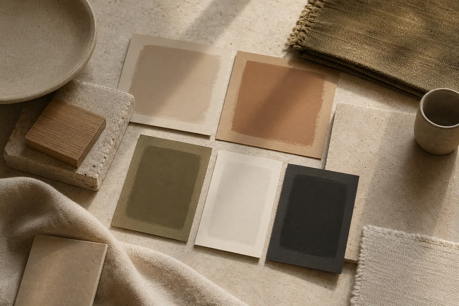
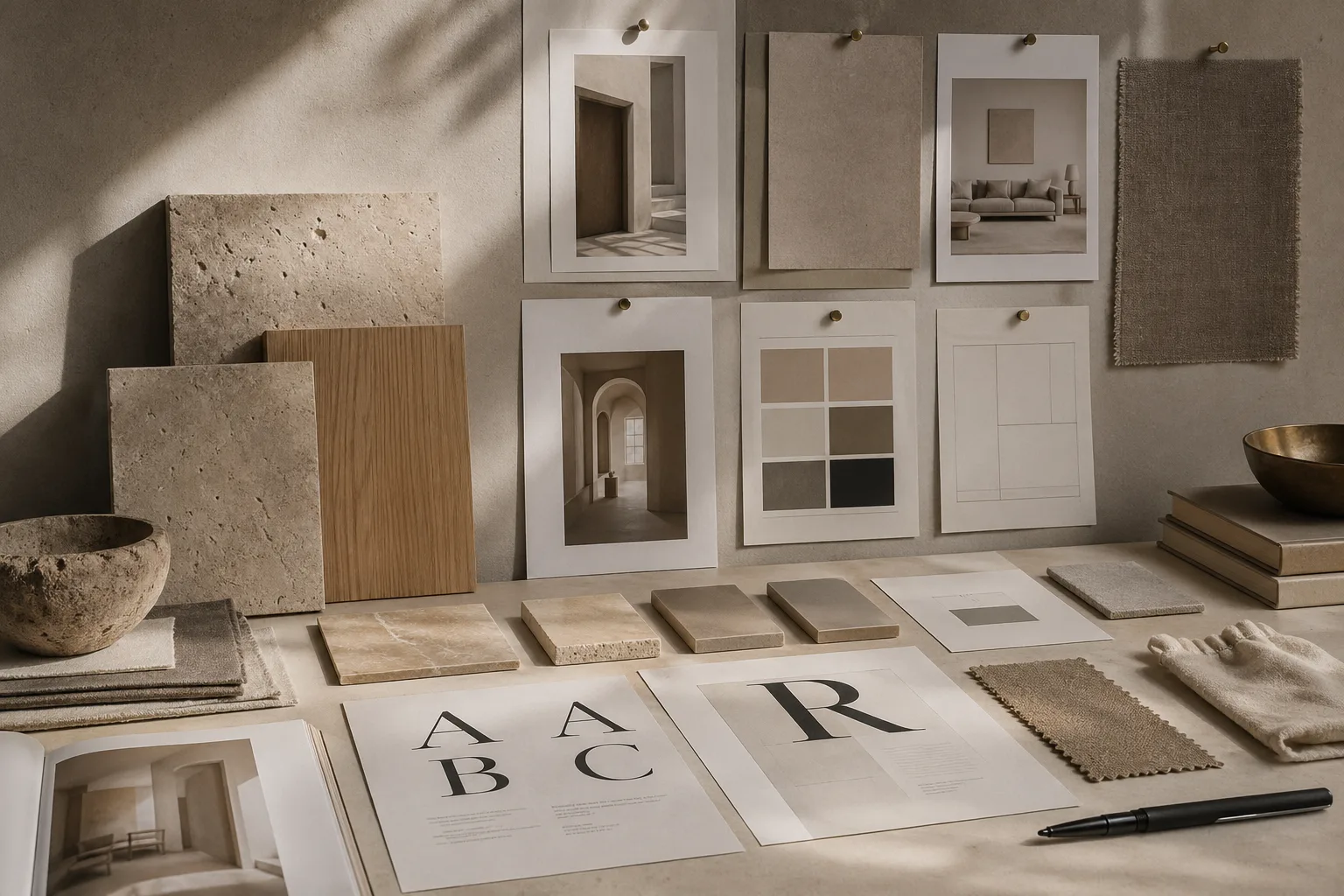
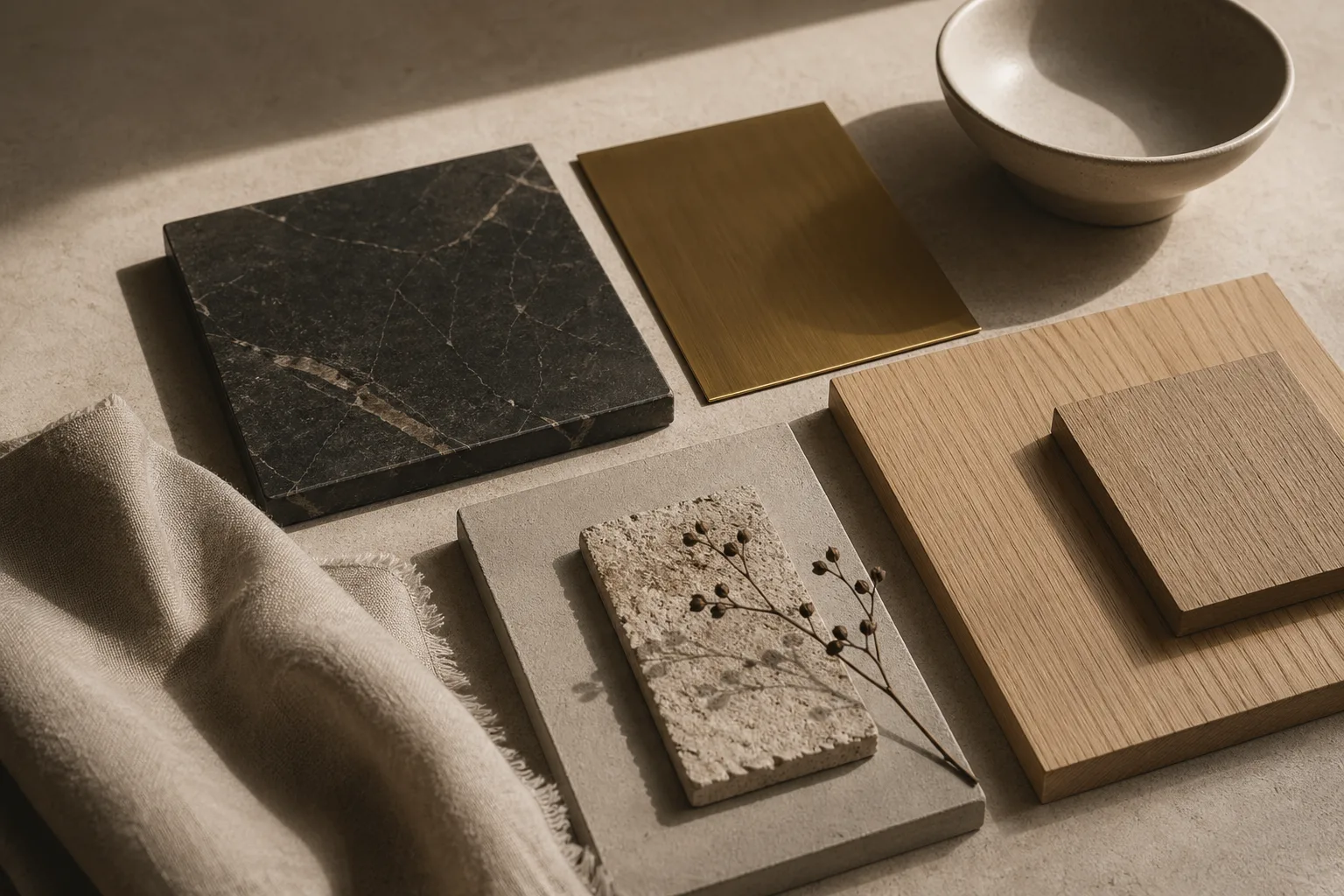
Dark, glossy, or highly contrastive materials often feel heavier because they pull the eye more strongly. Pale, matte, and porous finishes usually feel lighter, even when they occupy more surface area. That is why a charcoal stone plinth can anchor a room while a larger plaster wall recedes. The perceptual mechanics are similar to typographic emphasis, where blacker, sharper forms naturally claim priority.
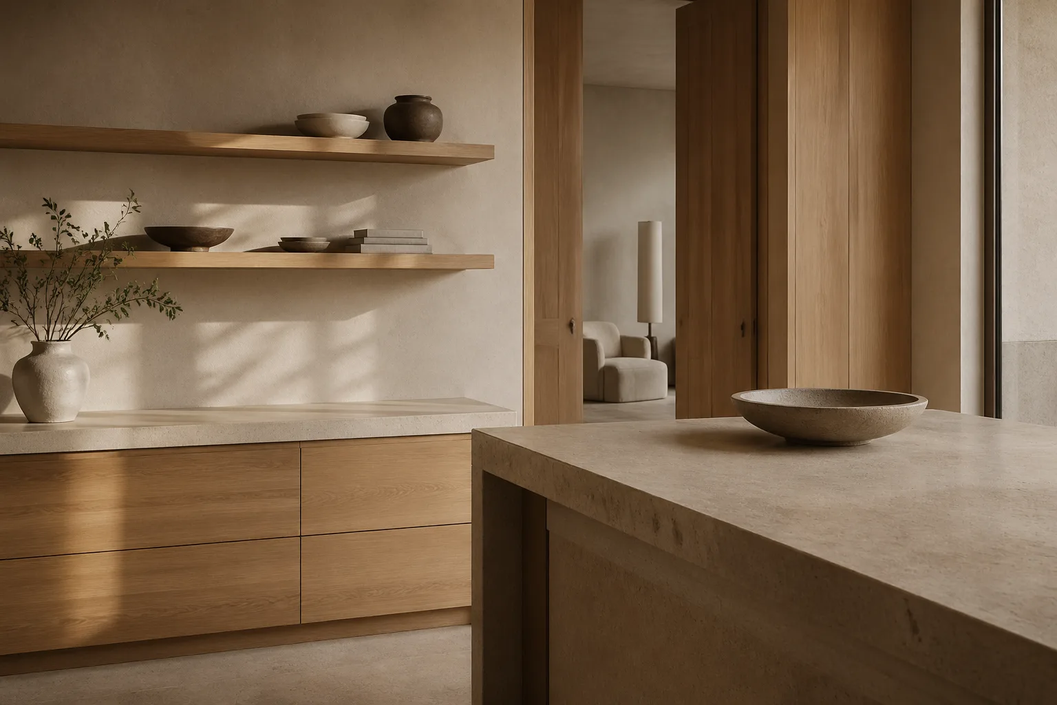
Weight is also relational. Oak can feel airy beside basalt and unexpectedly substantial beside white linen. This is where material choice intersects with the sequencing principles described in visual hierarchy and the tonal behavior discussed in color psychology. No material exists in isolation; it is always read against its neighbors.
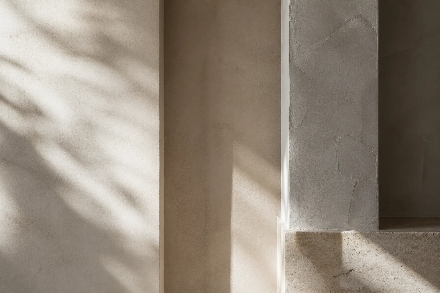
Surface finish complicates the picture in useful ways. A honed stone may feel quieter than polished metal, even if the stone is darker, because reflection alters intensity. Likewise, soft textures can visually expand an object without making it feel aggressive. Designers often use this to keep minimalist rooms from tipping into severity, a balance that also supports clean-surface interiors.
Learning to see visual weight turns styling into composition. Instead of asking whether a room needs more objects, designers begin asking whether it needs a lighter counterpoint, a darker anchor, or a more breathable interval between strong materials.
Where to Go Next
For a broader editorial map of the site, visit the about page, browse the latest writing on the homepage, or continue with linked essays on typography, color psychology, and cross-disciplinary design continuity.